
UX design for spatial computing: lessons from 50 years of aviation human factors research
Special Report Edition - 9 min read

When you think of cutting-edge user experiences (UX), you might think of people using spatial computing headsets like the Apple Vision Pro and Meta Quest 3. Here, digital objects are seamlessly blended with the real world - technology also referred to as “mixed reality” (MR) or “augmented reality” (AR).

A Meta Quest 3 user playing LEGO Bricktales in MR. They can build a structure on top of their living room table, while being able to see their environment - something they couldn’t do in virtual reality (VR), where they are fully immersed in a digital world. Image from Meta.
UX design for spatial computing headsets is often thought of as uncharted territory. I’m here to make the case that it isn’t, based on my experience leading design research for spatial computing UX for the better part of a decade. I’ll lay out why and how we can learn from 50 years of designing for aviation displays, offering five design principles to build better spatial computing UX.
Analogous Inspiration
A common approach for designing for cutting-edge technology is analogous inspiration. Here, you learn from an analog of an environment or a population that is unreachable - or may not yet exist.
Imagine your team wants to build a resort on Mars. Where might you go? Who are your target customers whom you’d want to learn from?
While traveling to Mars is probably unfeasible, you could research existing resorts built in extreme conditions, such as an “undersea residence” or an ice hotel. You could read up on people who put themselves in extreme conditions, for lack of a better word, “fun” - analogs to potential future Mars resort-goers. These folks could include people who attend Burning Man, people who race yachts around the world, or Marathon des Sables runners, who partake in a six-day, 250 km run through the desert. Their goals and motivations can give you a glimpse into who might someday want to vacation on Mars, and consequently, how to build for their needs.

Marathon des Sables runners, who partake in a six-day, 250 km run through the desert, could serve as analogs to potential future Mars travelers. Image from Marathon des Sables.
I love using analogous inspiration because it allows us to see a product or design challenge in a new light, and can teach valuable lessons that apply to building whatever cutting-edge technology we’re working on. Here, I’ve applied analogous inspiration to spatial computing experiences by asking, When else in the history of technology have we designed to blend digital objects with the physical world? Aviation display design.
Why is aviation display design relevant to spatial computing UX?
Aviation has long implemented environmental integration, where digital information is overlaid on the visual environment outside of the cockpit. This was done to reduce the need for the pilot to move their gaze away from the windshield. We see environmental integration in both heads-up display (HUD) technologies, and “near-to-eye” displays - also known as head- or helmet-mounted displays (HMDs). These technologies are analogs of spatial computing headsets like Quest 3 and Apple Vision Pro.

HUD showing computer-generated runway imagery overlaid on the physical environment. Image from NASA, in Human Factors in Aviation, Chapter 14.
Human memory and attention are key considerations in HUD and HMD design - specifically, designing to minimize cognitive load and increase situation awareness.
Cognitive load is the amount of working memory resources we use - in other words, how much of our “mental scratchpad” we’re taking up at a given time. If you’ve ever been at a conference and tried to remember people’s names and companies while trying to navigate towards lunch in a new city, you’ve been in a “high cognitive load” situation.
Situation awareness is your ability to perceive your environment, understand what’s going on, and respond appropriately. If you’ve ever bumped into someone while staring at your phone, you’ve experienced low situation awareness. We also know that cognitive load and situational awareness are linked - the greater your cognitive load, the lower your “bandwidth” is to pay attention to your surroundings.
Why are cognitive load and situation awareness important for spatial computing user experiences?
We need to consider how we can design to reduce cognitive load and increase situation awareness because:
It makes for a better user experience. Imagine trying to build that LEGO fort when you’re distracted by the user interface, or unable to see your environment, causing you to bump into furniture.
Spatial computing headsets aren’t just for consumer applications. They’re already used in engineering, architecture and construction and defense. This year, we’ve read predictions of Apple Vision Pro supporting workplace productivity and helping surgeons see vital data during operations, where low cognitive load and increased situation awareness are vital.
One more thing
As you read this report, you’ve probably glanced at your smartphone, or flipped between tabs - attending to multiple sources of information, going between focused reading and monitoring incoming messages. We have no reason to believe this behavior will change as we move from 2D displays into spatial computing headsets.
Guess who else attends to multiple sources of information in a display? Pilots.
Pilots must efficiently attend to multiple sources of information - for example, balancing between a focused task and general flight information monitoring. They need to do this for hours at a time, in high-consequence scenarios. We therefore have much to learn from aviation display design.
Spatial computing design principles informed by aviation displays
We’ll examine five design principles that can help reduce cognitive load and increase situational awareness, informed by human factors research on aviation display design.
1. Group similar information closer together on a headset display.
When a task requires the user to integrate multiple sources of information, that information should be grouped in close proximity to help the user best perform the task. Formally known as the proximity compatibility principle, you can think of this as: tasks that cluster together in our minds should be clustered together in a display. We can see this at play with the Apple Vision Pro default home screen - communication apps, like Mail and Messages, are grouped closer together, whereas “functional” apps, like Settings and the App Store, are grouped closer together.
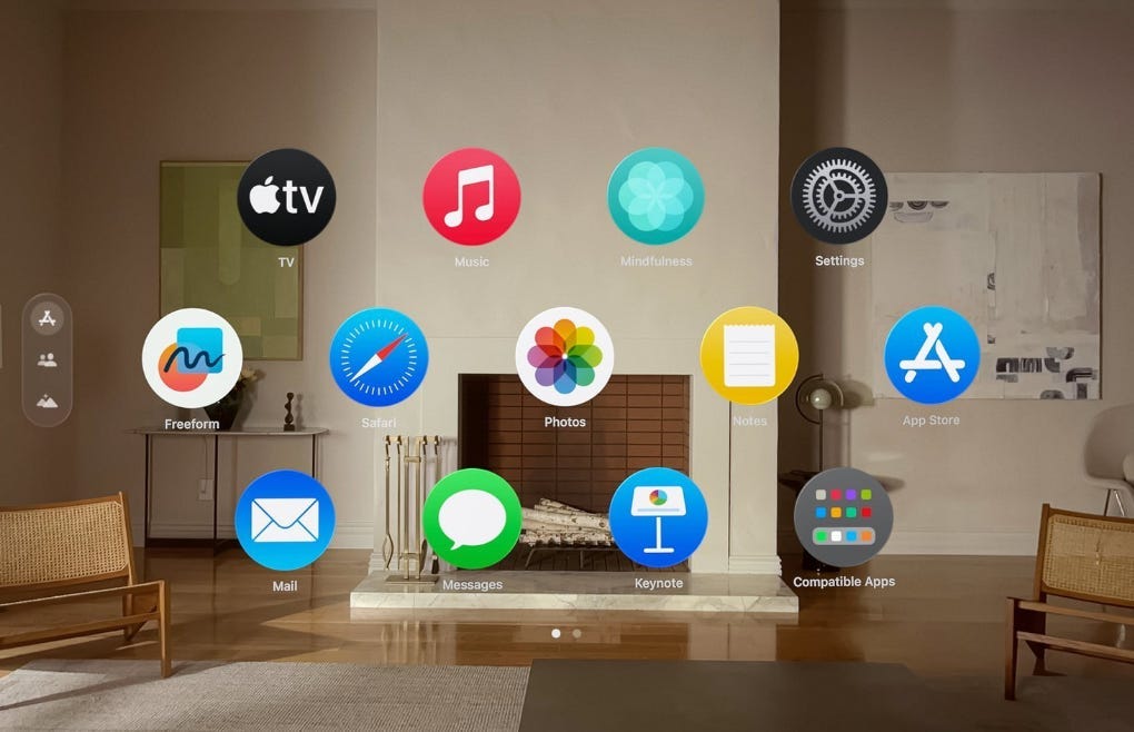
Apple Vision Pro Home Screen Interface, following the proximity compatibility principle.
Remember that to effectively group content, we need to understand the user's goal and mental model (that is, how users understand the world - including how they think your product works), and provide them with control to customize their displays to their needs.
2. If it’s not relevant to the user’s goal, it’s clutter.
Presenting too much information to a user is literally referred to as “clutter” in the human factors literature - it distracts the user, taking attention away from the information that they need, and adding to cognitive load.

Screenshot from Keiichi Matsuda’s Hyper-Reality concept video, demonstrating what not to do - cluttering the user’s display with information unrelated to the user’s goals.
To avoid cluttering a display, we need to strike the balance between too much and too little relevant information. Easier said than done - we need to first learn users’ goals and mental models to understand what spatial content (if any) we should prioritize showing by default. Once we have a better understanding of the information a user needs to access for a given task, we can prioritize that information, displaying it closer together on the display.
3. Clearly signal what “mode” the user is in to avoid confusion, errors, and frustration.
Mode errors occur when a user takes an action, believing they are in a given state, when in fact the system they’re using is in a different state. An example from aviation, where mode errors have been extensively researched, is a pilot entering parameter values on a correct entry dial, when in fact, the panel was in a different, automated mode.
In spatial computing headsets, mode errors could occur if the user has multiple similar-looking panels in front of them and they quickly transition from interaction with one to another, or if interaction patterns differ between an MR and VR experience, and a user quickly transitions between the experiences, erroneously applying the interaction patterns from the previous mode. We can design to mitigate mode errors by providing users with clear visual affordances about which app they’re in (especially important if your app resembles another commonly-used app), and a clear transition point between MR and VR modes (e.g., the physical reality dial button on the Apple Vision Pro).
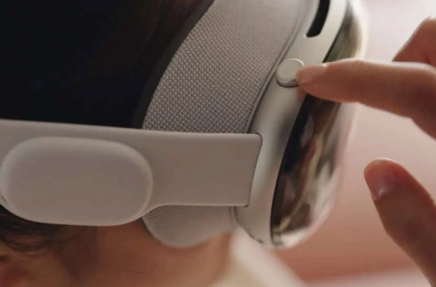
The Apple Vision Pro dial requires a switch between MR and VR modes. This interaction helps the user consciously “switch” their mental model over to the new mode, mitigating the possibility of mode errors.
4. Help users build a mental model for anchoring digital content in their physical environment.
Aviation human factors have taught us that allowing users to digitally store information for later use helps them more efficiently process their environment. This outsources memory and frees up bandwidth for other tasks. An effective way to do this in-headset is through anchoring content in the physical world, allowing it to persist in the user’s environment.
Anchoring is not new - in fact, it’s available in most spatial computing developer tools today (e.g., xCode, Azure Spatial Anchors). However, users may have limited knowledge that they can do this in-headset. For example, someone using their headset for work may want their MR calendar app to open in the same place on their desk every time they put on their headset. Anchoring the calendar allows them to:
“outsource” remembering the date (something you can see at a glance, rather than something you need to remember).
save time switching between apps.
save the effort of loading and repositioning the content every time they put on the headset.
While making persistence a default might be tempting, remember that depending on the user’s goal, one person’s helpful calendar is another person’s “clutter”. Consider how we might leverage existing mental models, like the option to pin an app to our laptop docks, to signal to users that they have the option to anchor content in their physical space.
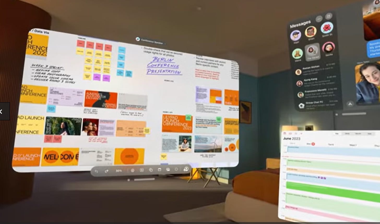
Anchoring an app in your environment (e.g., your calendar at the bottom right) can help you outsource memory and reduce friction, saving you from switching between apps and reloading the app each time you put on the headset.
5. Only leverage AI in-headset when it can offload cognitive load from real-world tasks.
Just as automation has become a key part of designing for aviation display systems, how might we effectively leverage AI in spatial computing UX to reduce cognitive load? A recent article outlined how AI can help reduce cognitive load for front-line healthcare practitioners, for example, through rapid collection and analysis of clinical assessments, physiologic observations, and documentation. With future spatial computing headsets, we’ll likely have access to this functionality, while remaining heads-up and hands-free (relative to a smartphone or laptop). How might AI augment the user’s capabilities in-headset to reduce cognitive load and maximize situational awareness, while maintaining bystander privacy?
Summary
Analogous inspiration can help us design for cutting-edge technology. Here, we learned from 50+ years of aviation display design to generate five design principles for spatial computing UX. A common theme across the principles is gaining a clear understanding of your user’s goals and mental models to inform display design. For more information about building a deeper understanding of user goals, check out our Customer Understanding Toolkit.
Want to brainstorm about analogous inspiration for your product? Learn more about your customers’ goals and needs? Better design products for human memory and attention? Sendfull can help - reach out at hello@sendfull.com to learn more.
That’s a wrap 🌯 . Stay tuned for next week’s Sendfull newsletter.